
Tabular Representation and Summary Statistics for One Categorical Variable
Turn a list of category labels into a useful table. Learn to count observations, calculate their proportions and percentages, and use those numbers to explain what the data show.
By the end of this lesson, you should be able to:
- Construct a frequency table for one categorical variable.
- Calculate relative frequencies, percentages and clearly labeled ratios.
- Describe a categorical distribution using numbers and context.
- Check whether a table supports a claim about the recorded group.
Before you start: Identify a categorical variable and distinguish a sample from its population. Review Topic 1.2 if you need a reminder.
First time learning this? Follow the Cedar High example, then build the small table in Worked Example 1.
Here to revise? Review the key ideas, then try the practice questions.
The concept in 60 seconds
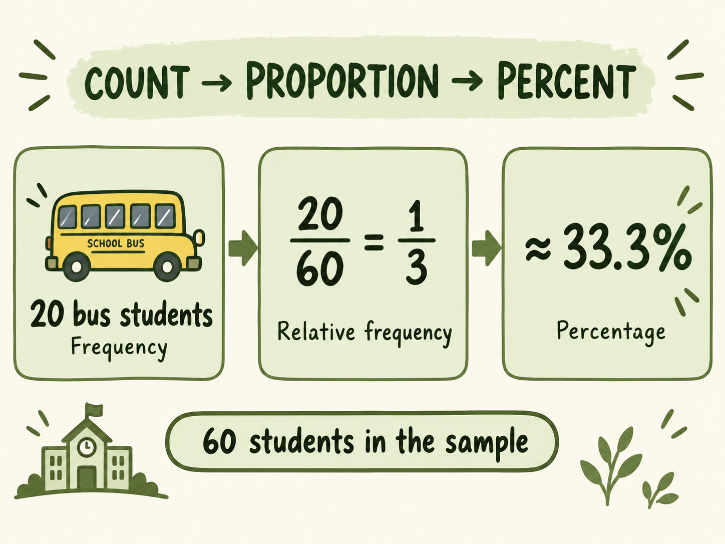
A frequency table tells us how many observations fall in each category. A relative frequency table tells us what fraction of the recorded group falls in each category.
For example, bus travellers out of students gives , or approximately .
A table is useful when you can turn it into a clear statement: “About of these sampled students travelled by bus.” Always name the category and the group behind the denominator.
One caution: the largest category is not automatically a majority. A majority means more than half of the group.
What is the main travel method at Cedar High?
Continue the fictional school scenario from Topics 1.1 and 1.2. Cedar High has enrolled students, and a sample of students records each student’s main home-to-school travel method on the Tuesday being studied.
Each sampled student has one recorded method. The completed sample contains Bus, Car, Walk and Bike responses. These invented totals describe all sample records; the preview rows shown in Topic 1.2 were only a small part of that sample.
| Main travel method | Frequency: students | Relative frequency | Percentage |
|---|---|---|---|
| Bus | |||
| Car | |||
| Walk | |||
| Bike | |||
| Total | exactly, before rounding |
The observational units are students. The categorical variable is main travel method. Counts and percentages summarize the category responses; they are not measurements of individual students’ travel durations.
Predict before reading on: Which travel method is most common? Is it used by a majority of these sampled students?
Check your prediction
Car is most common, with of students, or . It is not a majority because is less than . No single travel-method category has a majority in this sample.
Key ideas and notation
Category
A possible label for a categorical variable.
For main travel method: Bus, Car, Walk or Bike.
Frequency
The number of observations in a category. It is also called a count.
Bus has a frequency of students.
Relative frequency
The category count divided by the total count. It describes a share of the group.
Bus has relative frequency .
Distribution
How observations are spread across the categories.
The travel-method distribution is described by the category counts or proportions.
Mode: most common category
The mode is the category with the highest frequency. Here the mode is Car; is its count. If categories tie for the highest count, report the tie rather than selecting one arbitrarily.
You may see used for a category’s frequency and for the sample total, giving relative frequency . For a particular sample category, its proportion can also be written (“p-hat”), connecting this lesson to Topic 1.2.
Two columns do not automatically mean two variables. A table listing travel-method categories and their frequencies summarizes one categorical variable. The frequency column is the number of students with each recorded method.
How to build a frequency and relative frequency table
Apply the steps to Cedar High
The categories have counts , , and . Their sum is . The denominator for each sample relative frequency is therefore , not the school’s population size of and not the number of categories, .
For Bus, divide by . For Car, divide by . Repeat for Walk and Bike. A combined table can show counts, fractions or decimals, and percentages together, as in the table above.
Check the whole table
- Counts: nonnegative whole numbers, adding to the total number of observations.
- Relative frequencies: each between and , adding to before rounding.
- Percentages: each between and , adding to before rounding.
Rounding check: categories with observation each have exact relative frequencies , and . To one decimal place, their percentages are , and , totaling . The small difference comes from rounding. Keep exact fractions or extra decimals during calculations and round the final answers.
Make the denominator match the records
For this single-choice travel question, each student has one main method, so categories do not overlap and every recorded response belongs somewhere. If there are missing responses, state whether your denominator includes all selected students or only students with valid recorded responses.
A question such as “Which travel methods did you use this week? Select all that apply” has a different counting rule: one student may appear in several categories. In that situation, percentages of students can exceed in total. Do not use the single-choice total check without reading the question.
Proportions, percentages, ratios and supported claims
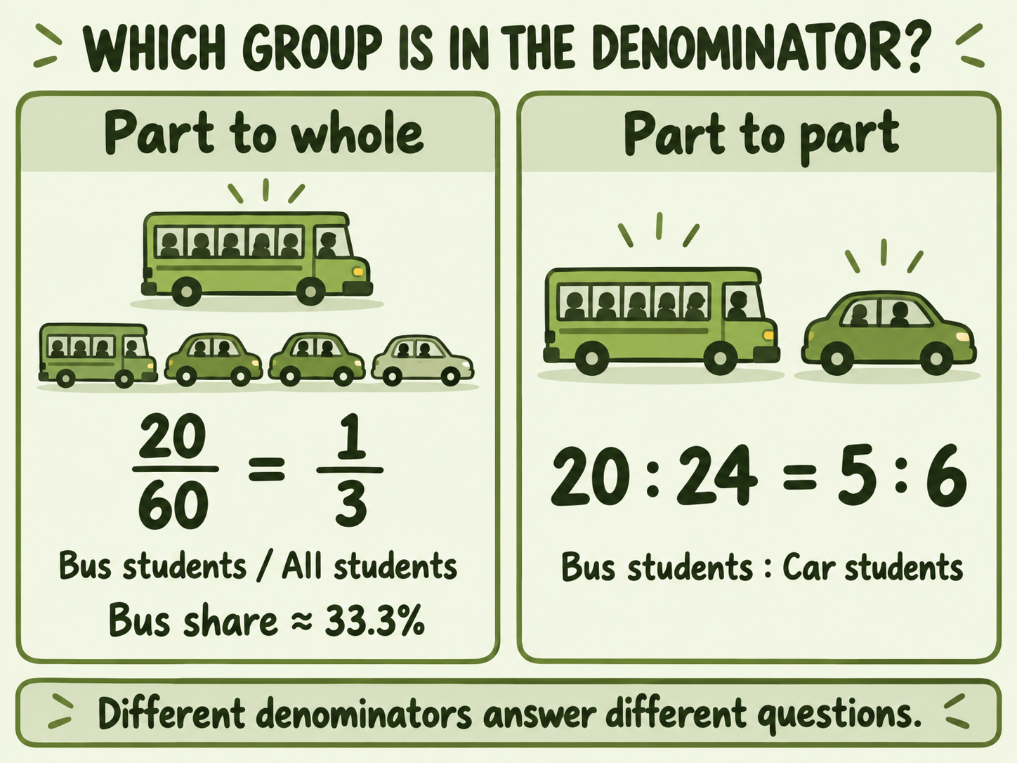
, , approximately and approximately describe the same share of Cedar High’s sample. A part-to-whole ratio of carries the same information when clearly labeled “Bus students : All sampled students.”
Part to whole versus part to part
The ratio of Bus students to Car students is . This compares two categories. It is not the proportion of all sampled students who travelled by bus, because Walk and Bike students are not included in that comparison.
Support a claim with the right comparison
“Car is most common.”
Supported for this sample: Car has the largest count, , and the largest relative frequency, .
“Most students travelled by car.”
If “most” means a majority, this is not supported: , which is less than . Write “most common method” to avoid ambiguity.
“A majority did not travel by car.”
Supported for this sample: Bus, Walk and Bike total students; .
“Car exceeds Walk by .”
Supported: . In counts, the difference is students.
A table of categorical labels does not call for the mean or median of those labels. Averaging numerical codes such as would depend on arbitrary coding. Use counts, proportions and clearly defined comparisons to describe this categorical distribution.
Keep the scope of your conclusion: These results describe the sampled students. The bus proportion is a statistic. It does not prove that exactly of all Cedar High students travelled by bus. A broader conclusion depends on how the sample was obtained and would need additional statistical reasoning.
Worked examples
Example 1: Build a table from raw category labels
Question: library visitors each choose one preferred reading category. Their responses are Fiction, Comics, Nonfiction, Fiction, Fiction, Comics, Nonfiction, Fiction, Nonfiction, Fiction. Construct a frequency and relative frequency table.
- Name the units and variable. The units are these library visitors. The variable is preferred reading category.
- Tally the responses. Fiction appears times, Nonfiction times and Comics times. Check: .
- Divide each count by . The relative frequencies are , and .
| Category | Frequency | Relative frequency | Percentage |
|---|---|---|---|
| Fiction | |||
| Nonfiction | |||
| Comics | |||
| Total |
Interpret: Fiction is the most common preference, chosen by of these visitors. Exactly is half, not a majority.
Example 2: Calculate a combined proportion and a ratio
Question: In the Cedar High sample, what proportion walked or biked? What is the ratio of Walk students to Bike students?
- Combine the relevant counts. Walk and Bike are separate main-method categories, so students walked or biked.
- Use the full sample for the proportion. , or approximately .
- Use the two category counts for their ratio. .
Interpret: About of the sampled students walked or biked. There were Walk students for every Bike student. These two results answer different questions.
Example 3: Decide whether a claim is supported
Question: A student says, “Car has the highest count, so a majority of the students travelled by car.” Evaluate the claim.
- Check the count. Car’s count of is larger than the other category counts.
- Check the majority threshold. A majority of requires more than students. Car has only .
- Calculate the share. , below .
- Write a corrected claim. Car was the most common main travel method among these sampled students, but it was not used by a majority.
Reflect: “Largest category” compares categories with one another. “Majority” compares a category with half of the whole group.
How to explain a table in context
Write a sentence that identifies the group, category and numerical evidence. When evaluating a claim, also state the comparison or threshold you used.
| Weak answer | Improved answer | Why it is clearer |
|---|---|---|
| “Bus is .” | “ of the sampled Cedar High students travelled mainly by bus that Tuesday, a proportion of , or about .” | Names the recorded group, method and denominator. |
| “Most are Car.” | “Car was the most common method in this sample, with students, or ; it did not have a majority.” | Distinguishes largest category from more than half. |
| “The ratio is .” | “The ratio of Walk students to Bike students was in the sample.” | Identifies both parts in the correct order. |
Description frame: “[Category] accounted for [count] of the [total] recorded [units], or [percentage], in [context].”
Claim frame: “The data [support / do not support] this claim for [group] because [calculation] is [above / below / equal to] [relevant threshold].”
You do not need to mention every category in every answer. Choose the numbers that answer the question, and describe a whole distribution with its important comparisons rather than an unexplained list.
Common mistakes and how to correct them
Dividing by the number of categories
Mistake: “There are methods, so Bus is .”
Fix: Use the total number of observations, . is the number of labels, not the number of sampled students.
Using the population as the denominator
Mistake: “The sample bus percentage is .”
Fix: These Bus responses came from the sample of . Use for the sample proportion.
Turning a part-to-part ratio into a whole-group percentage
Mistake: “, so of the whole sample travelled by bus.”
Fix: The whole sample also includes Walk and Bike. Its bus share is , not .
Calling the largest category a majority
Mistake: “Car is largest, so more than half used Car.”
Fix: Compare with . Car has ; it is largest without having a majority.
Mixing a proportion with a percentage
Mistake: “.”
Fix: . A decimal proportion is converted to a percent by multiplying by .
Ignoring the response rules
Mistake: “Every survey’s percentages must total exactly .”
Fix: Check for rounding, missing responses and multiple selections before deciding that a table is wrong.
Try a correction: “There are categories and Bus students. Therefore Bus has relative frequency , or , and a majority travelled by bus.”
Show the corrected reasoning
There are students in the sample. The bus relative frequency is , or approximately . A relative frequency of would be impossible for a part of this whole. Bus does not have a majority because its percentage is below .
Check your understanding: practice with solutions
These are original AP-style practice questions. Try each question before opening the solution. Use the hint when you need a starting point.
1. Construct a table from raw responses
students each select one lunch: Sandwich, Salad, Pasta, Sandwich, Salad, Sandwich, Pasta, Salad, Sandwich, Pasta, Salad, Sandwich. Construct a frequency table and give each category’s percentage to one decimal place.
Hint
Tally each lunch separately. The three counts must add to . Divide each by before multiplying by .
Solution and reasoning
Sandwich appears times, Salad times and Pasta times. Their frequencies total .
| Lunch | Frequency | Relative frequency | Percentage |
|---|---|---|---|
| Sandwich | |||
| Salad | |||
| Pasta |
Sandwich is the most common lunch among these students, but is less than half, so it does not have a majority.
2. Choose the correct denominator
Use the Cedar High table. Which calculation gives the proportion of the sample whose main travel method was Bus?
- , because there are travel categories.
- , because students attend the school.
- , because sampled students have recorded methods.
- , because Car is the largest category.
Hint
The numerator and denominator must refer to the same recorded group: the Bus students are part of which group?
Solution and reasoning
C. The sample bus proportion is . The other denominators refer to the category count, the whole school, or just the Car category, and do not give the requested sample share.
3. Recover a missing frequency
A library classifies all visitors during an hour as Adult, Teen or Child, with one category per visitor. There are Adults, Teens and an unspecified number of Children. Find the Child frequency and its relative frequency. Check the three relative frequencies.
Hint
Subtract the two known category counts from . Every category’s denominator is still .
Solution and reasoning
visitors. The Child relative frequency is , or . Adult is and Teen is . Check: .
4. Evaluate a majority claim
A student uses the Cedar High table to claim, “A majority of the sample travelled by car because Car is the most common category.” Is the claim supported? Write a correction with numerical evidence.
Hint
A majority requires more than half of the observations, regardless of the ranking of categories.
Solution and reasoning
The majority claim is not supported. Car accounts for , which is below . A correct statement is: “Car was the most common method among the sampled students, but it was not used by a majority.”
5. Explain a ratio and a proportion
For Cedar High, calculate (a) the ratio Bus : Car and (b) the proportion of the whole sample travelling by Bus. Explain why the two answers have different denominators.
Hint
Part (a) names two categories. Part (b) names a category and the whole sample.
Solution and reasoning
(a) . It compares Bus students with Car students. (b) The sample bus proportion is , approximately , because the whole sample includes all categories. Both are valid descriptions when their groups are clearly labeled; they answer different questions.
6. Handle missing responses honestly
A separate survey selects students. give a valid single travel-method response: Bus and Car. The other do not respond. Calculate the Bus relative frequency among valid responses, then state a limitation of the result.
Hint
The question specifies the group in the denominator. Do not silently treat missing responses as a travel category.
Solution and reasoning
Among the valid responses, Bus has relative frequency , or about . This percentage describes the respondents. The travel methods of the nonrespondents are unknown, so should not be presented as the exact bus percentage for all selected students.
Quick revision notes
- Frequency: the count of observations in a category.
- Relative frequency: , where is the category count and is the total observations in the stated group.
- Percentage: .
- Part-to-whole ratio: can express the same information as a proportion, when the groups are labeled.
- Part-to-part ratio: compares two selected counts; it is not automatically a share of the whole.
- Single-choice total check: counts add to the observation total; exact proportions add to and exact percentages to .
- Rounding: displayed proportions or percentages may have a small total discrepancy.
- Mode: the most common category; report any tie for the highest count.
- Majority: strictly more than , not merely the largest category.
- Context: identify the category, recorded group and evidence behind your claim.
Memory check: What is being counted? What is the whole group? Have I used its total? What do the numbers let me claim about that group?
A final AP-style understanding check
sampled residents each name the one material they recycled most often last week. The responses are Plastic: , Paper: , Glass: and Metal: . Each resident gives one response, and none are missing.
- Identify the observational unit and categorical variable. Construct a table with counts and relative frequencies.
- Identify the most common category. Does it have a majority?
- Evaluate the claim that a majority of these sampled residents named Plastic or Paper.
- Give the ratio Plastic : Paper and explain how it differs from the Plastic proportion of the whole sample.
Show a model answer and self-check
(a) An observational unit is a sampled resident. The variable is the material that resident recycled most often last week.
| Material | Frequency | Relative frequency | Percentage |
|---|---|---|---|
| Plastic | |||
| Paper | |||
| Glass | |||
| Metal | |||
| Total |
(b) Plastic is the mode, with of responses, or . It does not have a majority, because is less than .
(c) The claim is supported for these sampled residents: named Plastic or Paper; , above .
(d) . This compares those two categories. Plastic’s share of the full sample is , using all residents in the denominator.
Self-check: Did your counts total , your exact proportions total , and your claims name the sampled residents? Did you distinguish the largest category from a majority and label both parts of the ratio?
Before you move on, check that you can:
- Build a categorical table from raw labels or given category counts.
- Explain why each relative frequency uses its stated denominator.
- Distinguish a count, a proportion, a percentage and a ratio.
- Support a contextual claim with a calculation and an appropriate comparison.
Continue learning
A frequency table organizes the categories and their shares. Next, use graphs to make those comparisons easier to see.
Next lesson
Topic 1.4: Graphical Representations for One Categorical Variable →Connect frequency and relative frequency tables with bar charts and pie charts.
Previous: Topic 1.2 · Review table construction · Back to the lesson overview